David’s TeaReshaping the personality of summer teas

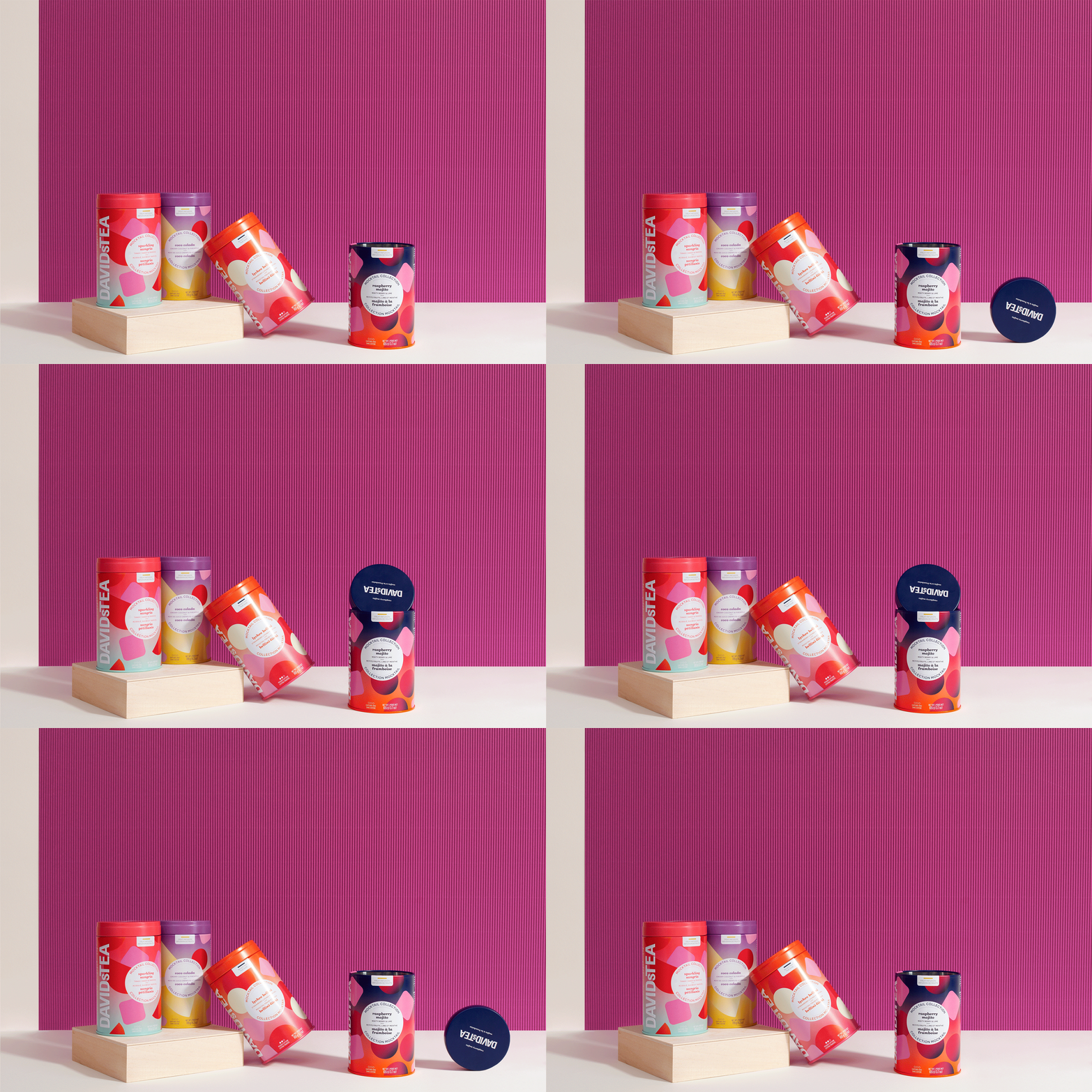
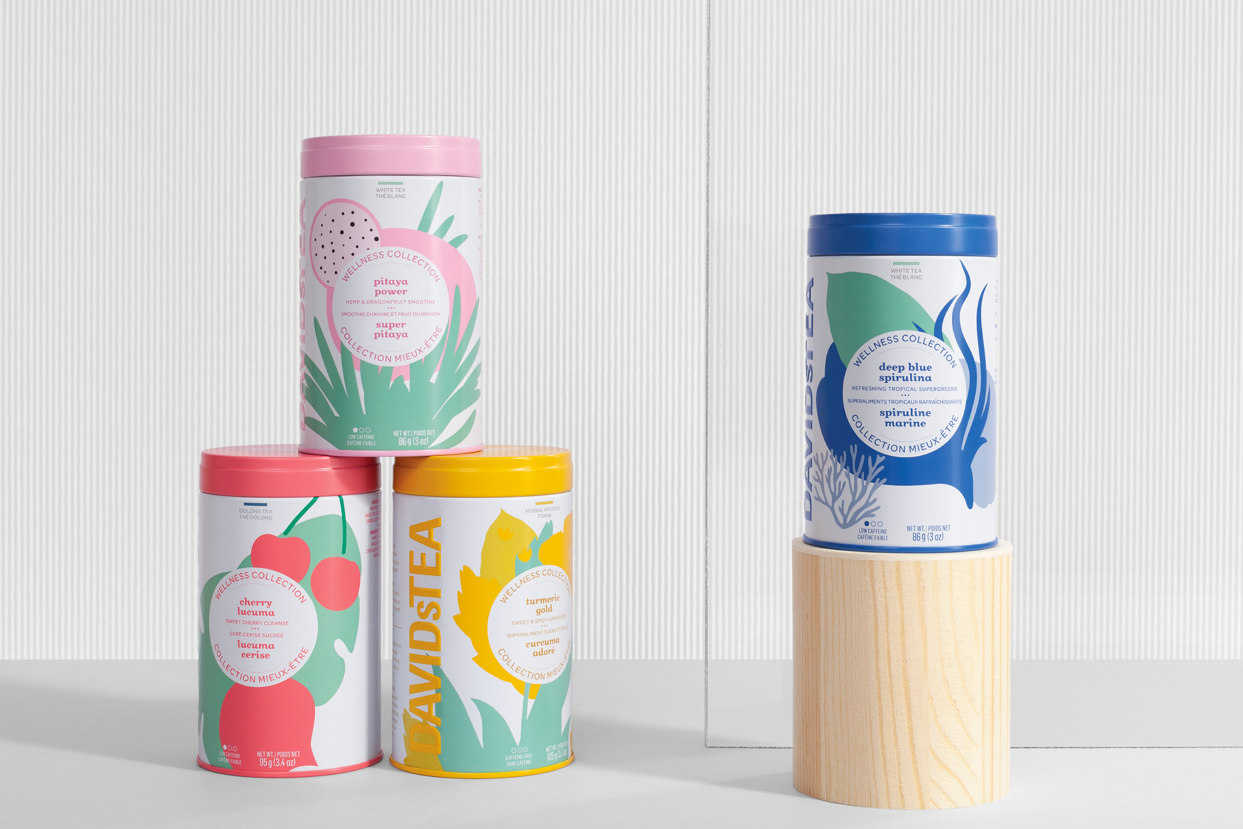
We revisited the packaging for David’s Tea summer teas to make them stand out while retaining the brand’s key elements—like the coloured round shape and typeface—, which had become signatures of David’s Tea. Brought together under a common theme called Miami, the three summer tea categories—well-being, cocktail, and tropical—had to share a family resemblance while standing out from each other on the shelves.
-
Consumer insight
Packaging design
-
Marie-Ève Caron, planning and brand strategy
Nicolas Boissy, art direction


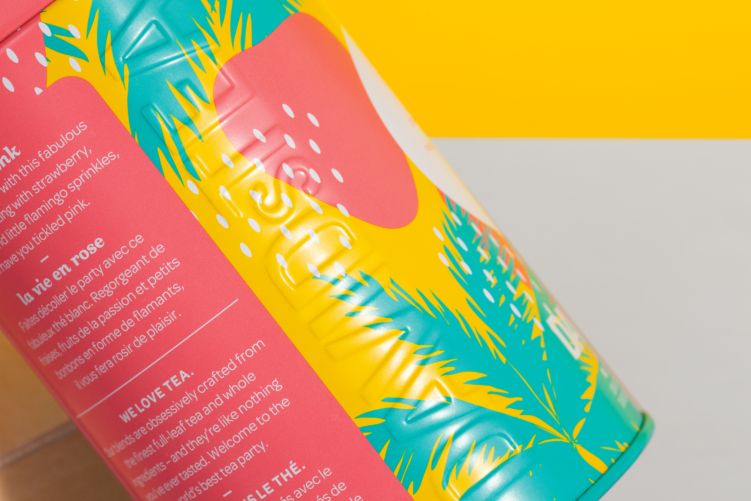
The package collection shared a graphics framework that was both modern and colourful, suggesting the summertime and a Miami-style wild side, while each box displayed unique motifs and colours to clearly identify the various flavours.
Idea
The same went for boxes in the Me to We collection—created through a partnership with the international charitable movement of the same name—, for which each purchase provided two weeks of clean water to an individual in a developing community in Kenya.

“For this pivotal range for David’s Tea, which is beginning to evolve from a graphics standpoint, La Famille was able to point us in the right direction and express our aspirations in a fresh and modern packaging concept.”
— Nathalie Binda, Vice President, Marketing and E-Commerce, DAVIDsTEA


Active listening. Ongoing exchanges. Empathetic dialogues. That’s how we work with you. Let’s start now.
© 2025 La Famille
