
FRUIT D'ORElevating a vision, beyond the product
The world’s second-largest processor of cranberries and wild blueberries, Fruit d’Or has grown into a major international player over the years. Yet its brand image remained rooted in traditional agricultural codes—misaligned with its scale, ambition, and global leadership. The mandate: evolve the brand to fully reflect its leadership position, its vertically integrated field-to-finish model, and its strong culture of innovation. The objective was to build a powerful, cohesive, and distinctive platform capable of supporting both B2B and B2C communications.
-
Market audit and analysis
Consumer insight
Brand strategy
Brand positioning
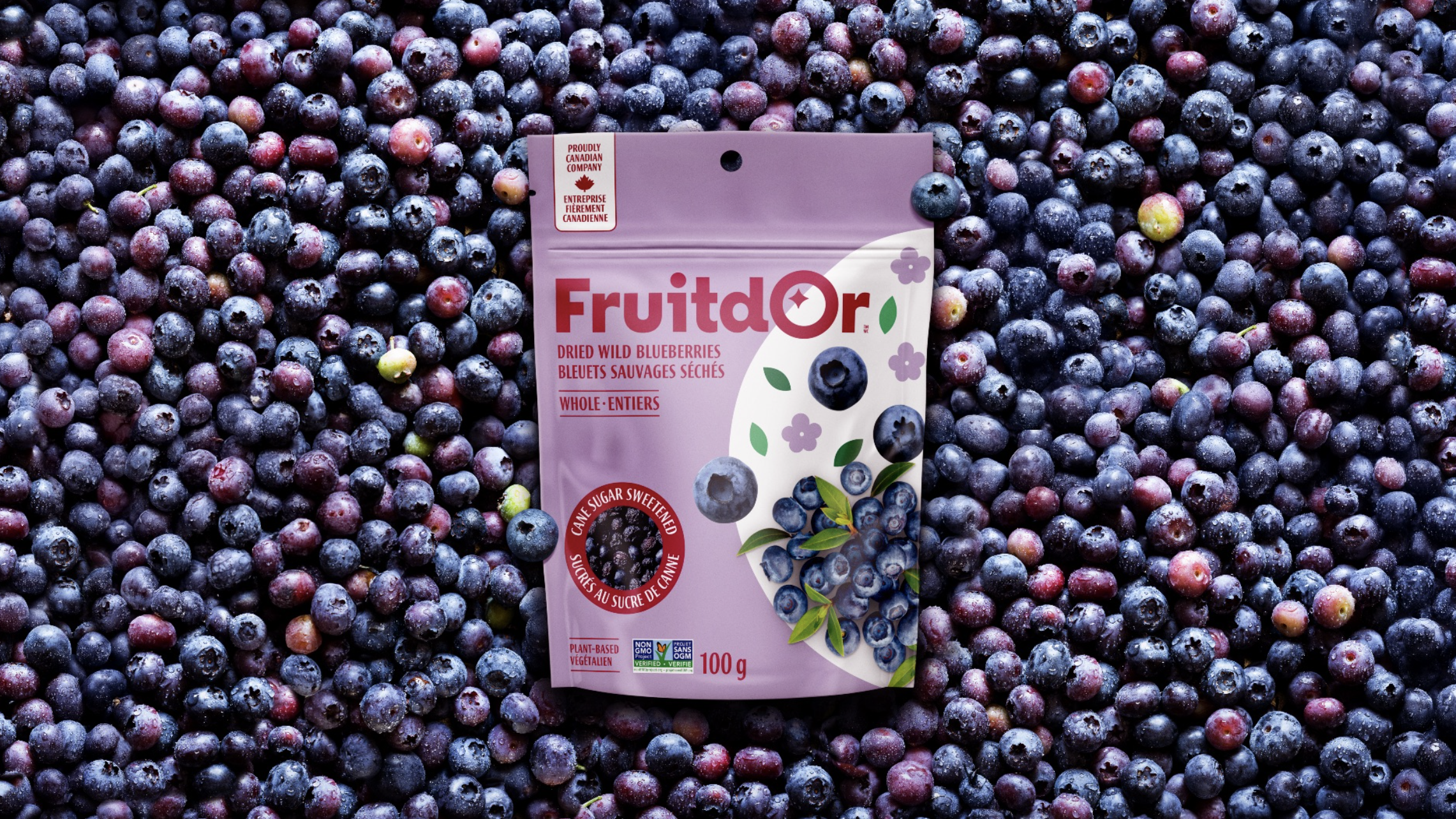
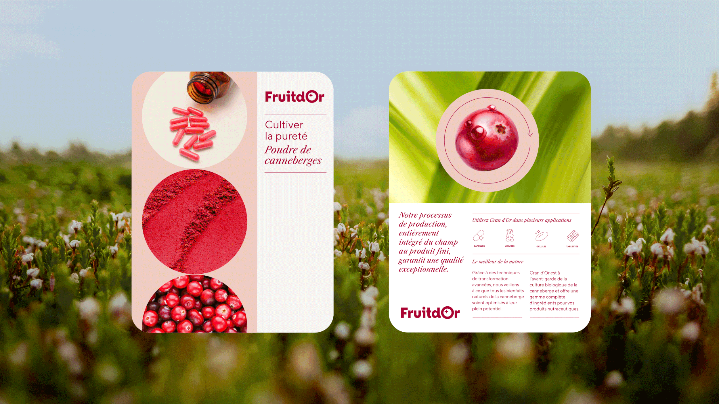
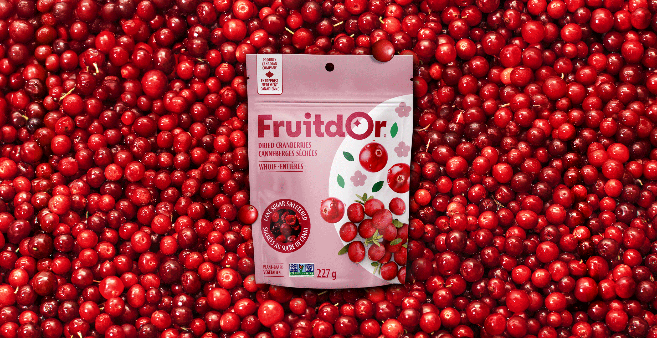
Packaging design
-
Marie-Ève Caron, planning and brand strategy
Caroline Reumont, Josée Martineau and Ariane Dray (logo), art direction
Hugo Léger and Kristina Landry, copywritingAntoine Foisy, motion design
Steve Desmarais, graphic productionVickie Rousseau, photo retouching
Pixi Studio, 3D designFruit d’Or image bank, factory and product photos
Through a series of strategic work sessions and in-depth interviews with internal teams, we deepened our understanding of Fruit d’Or’s culture and long-term ambitions. At the core of the process was uncovering what truly sets the company apart: a visionary organization driven by collaboration, a strong entrepreneurial mindset, and a constant desire to push boundaries.
Strategy
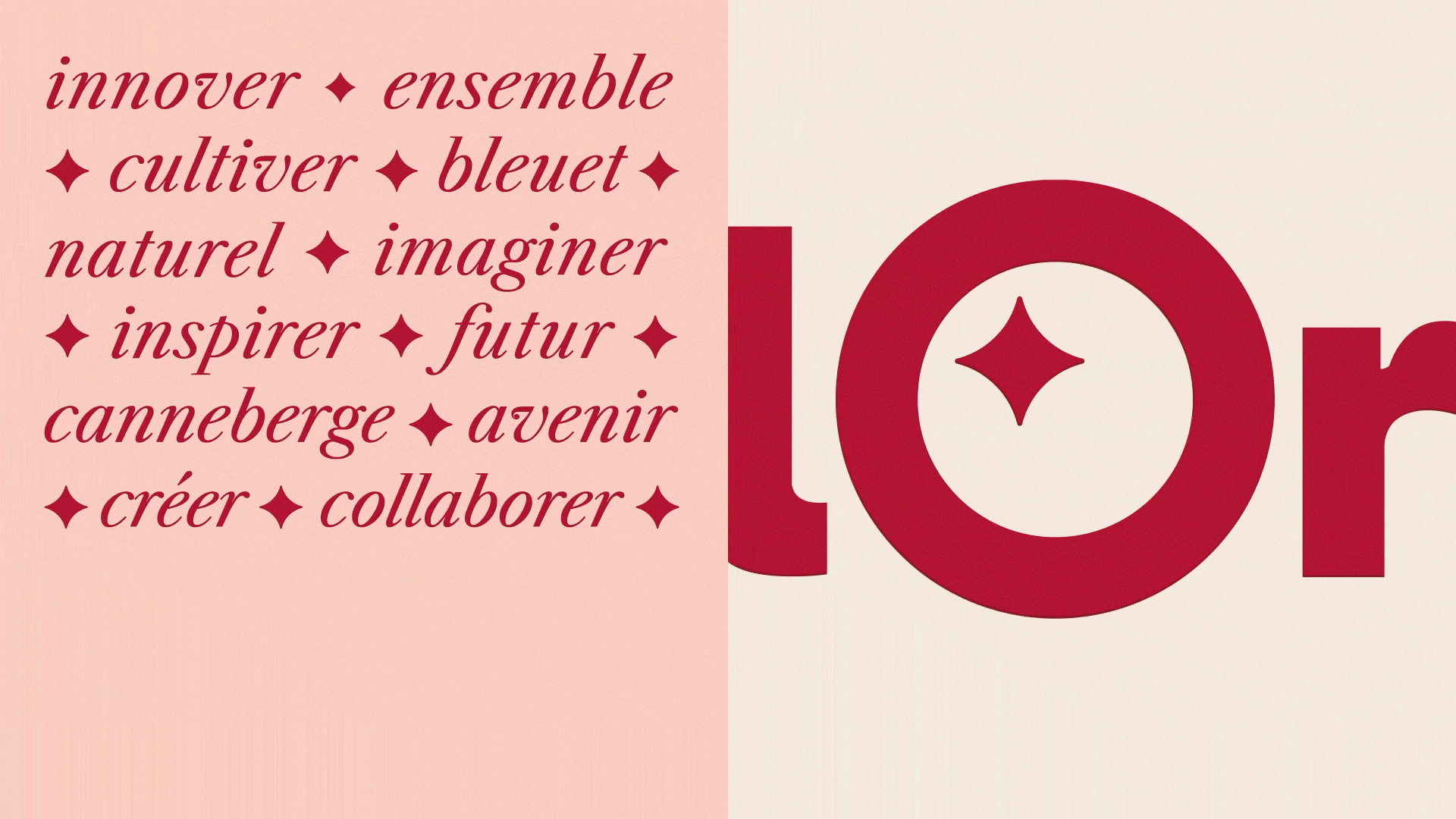
It was essential to move beyond the visual codes widely adopted across the agricultural category and assert a more modern, ambitious positioning. We repositioned the brand around its true engine: collective innovation. At Fruit d’Or, it’s not just small fruits that are cultivated—it’s long-term partnerships, new ideas, and value-added solutions. The platform expresses the strength of the organization, the richness of its ecosystem, and a forward-looking perspective rooted in sustainable growth.
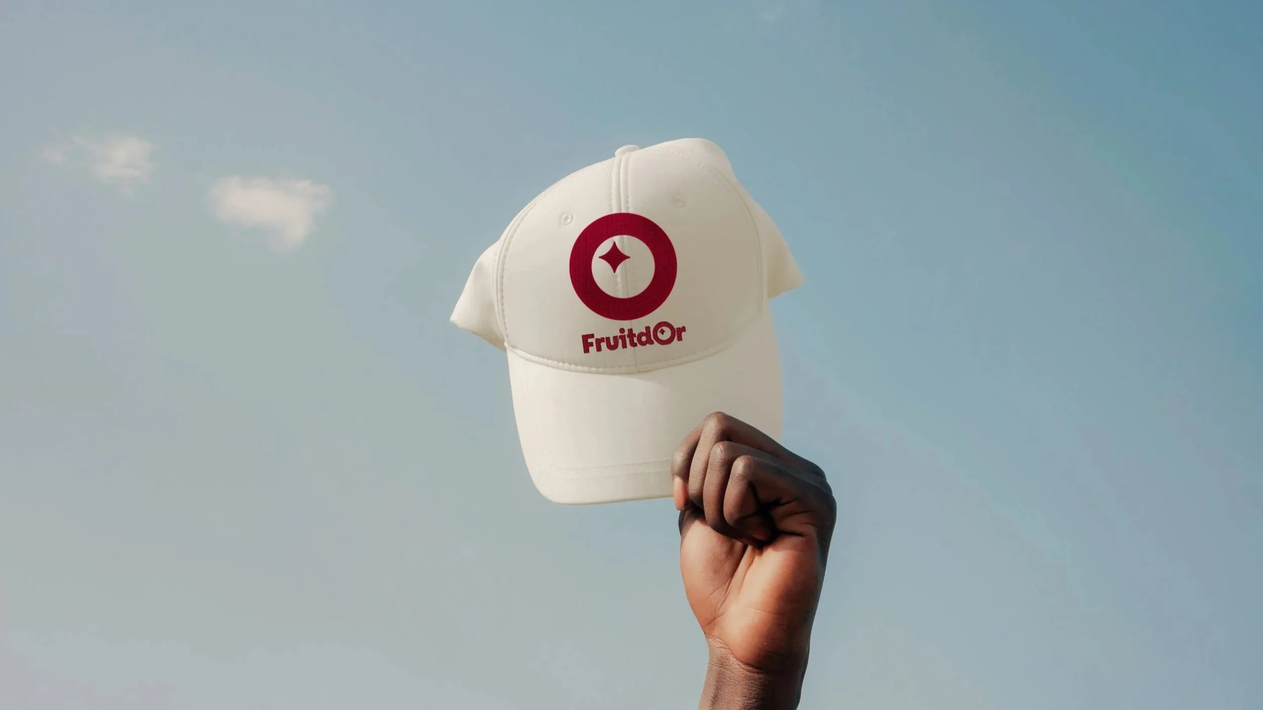
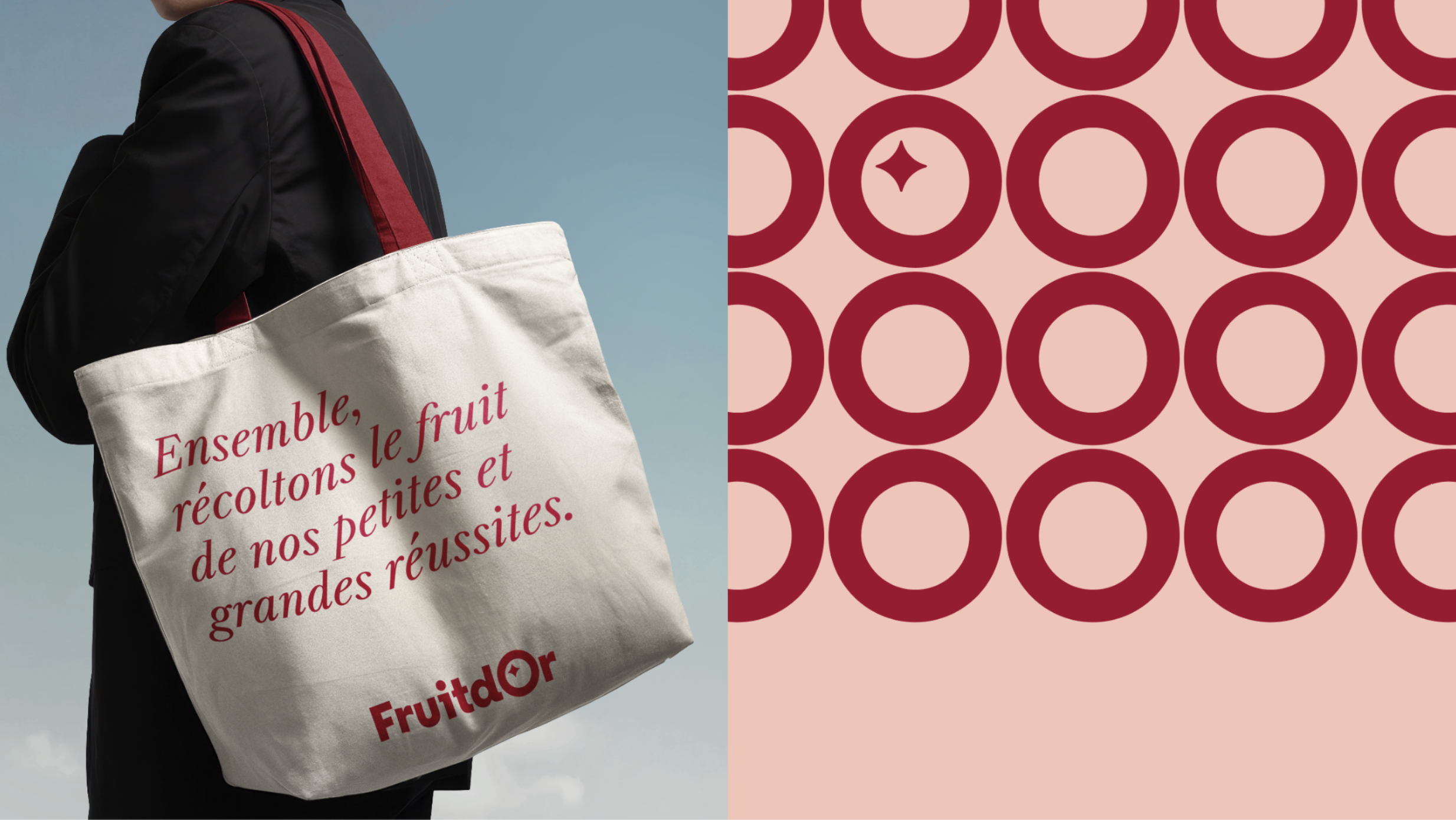
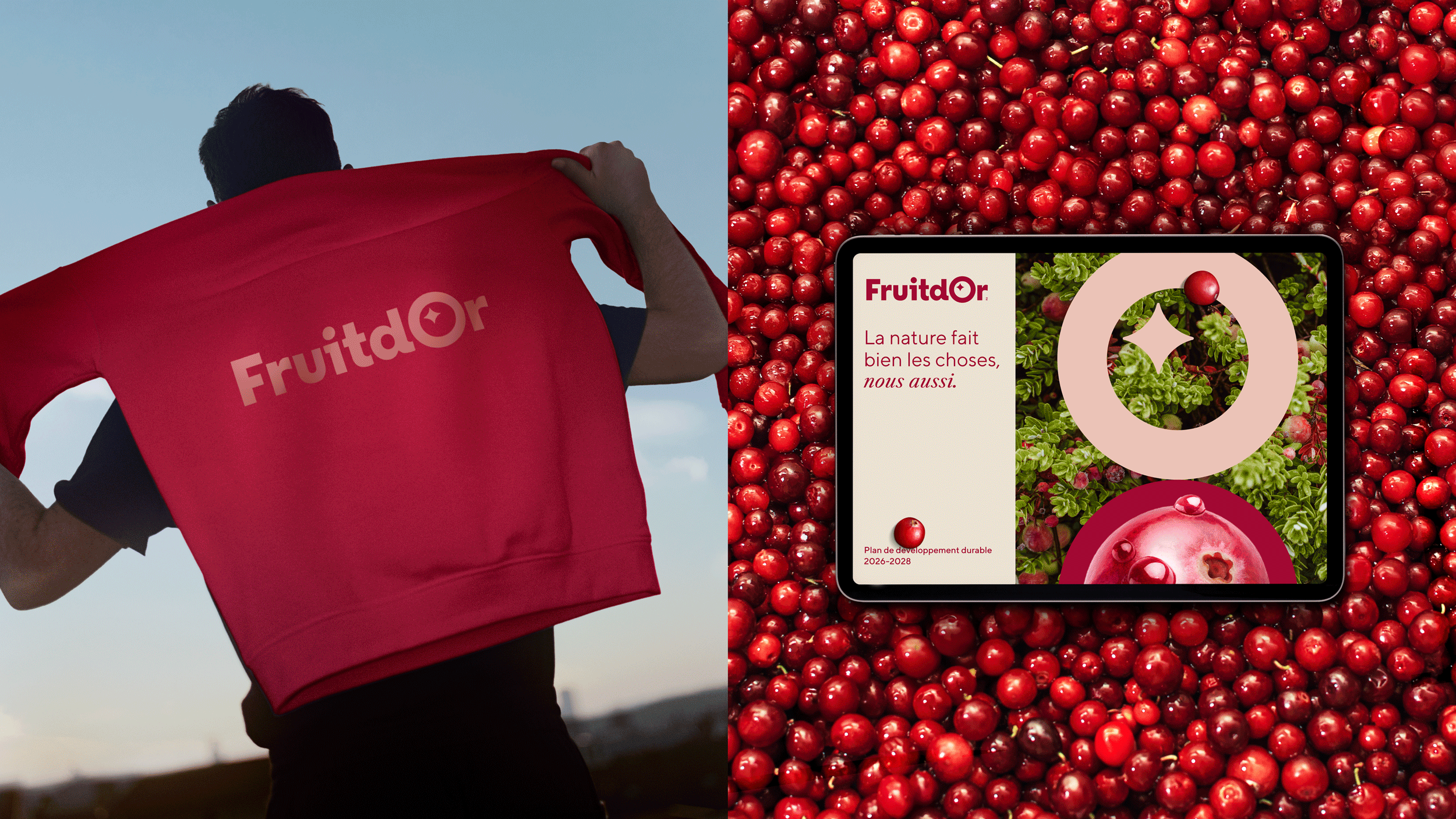
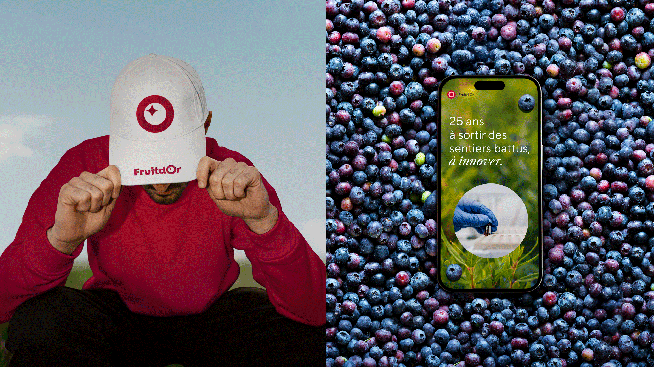
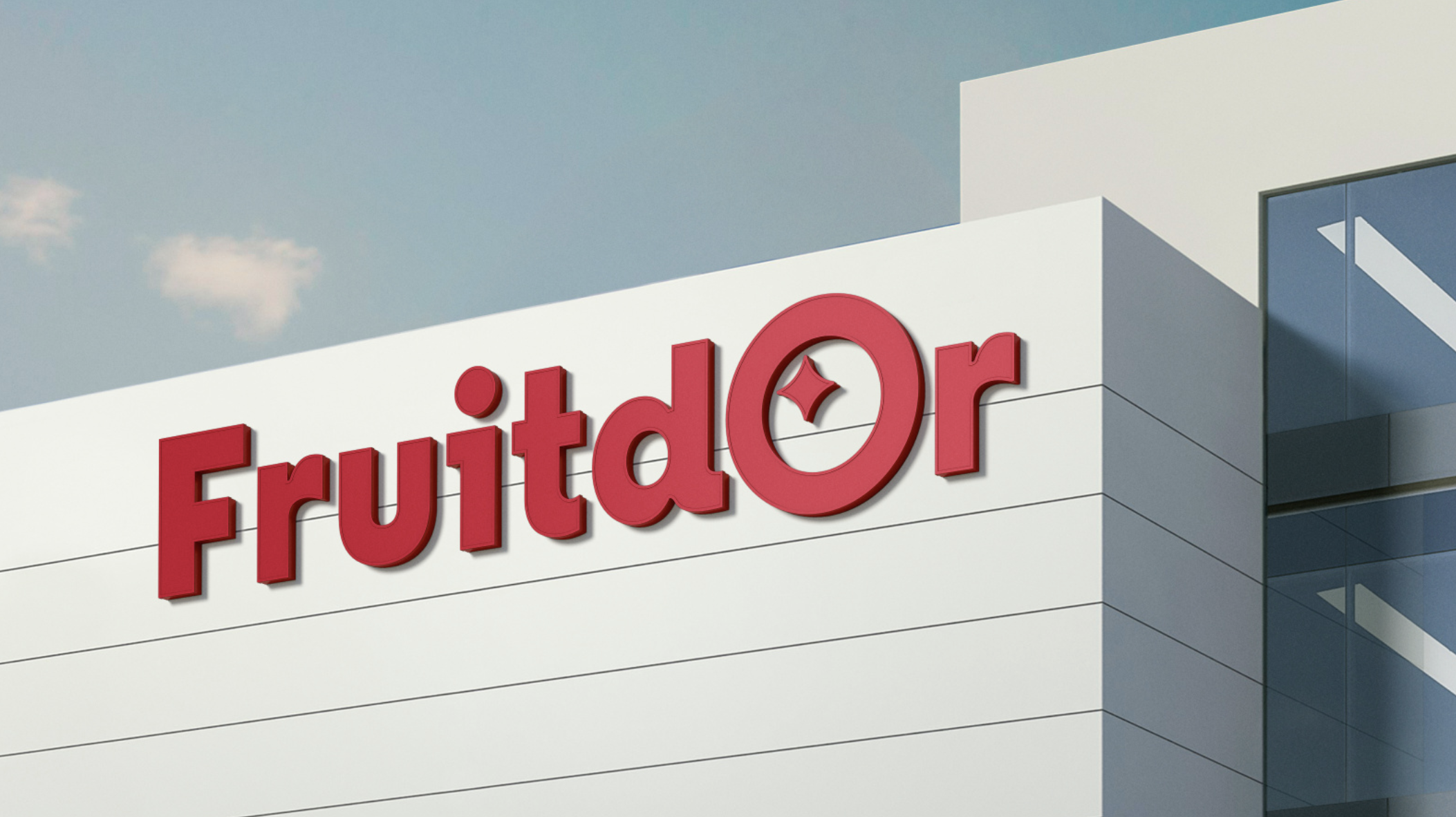
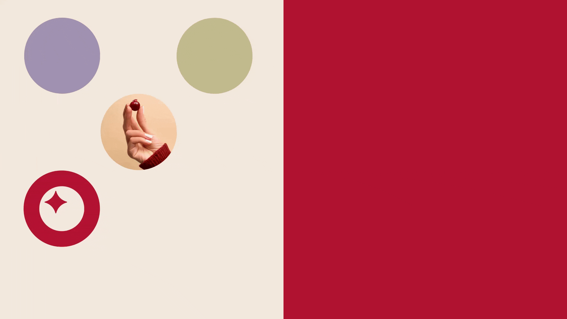
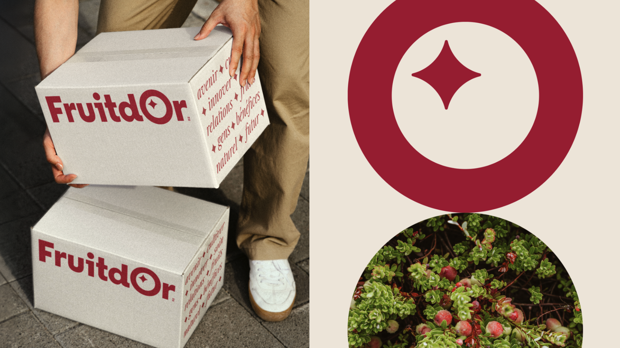
The new identity is built around a unifying creative principle: the circle. At once an evocation of small fruits, a symbol of collaboration, and a representation of an interconnected ecosystem, it becomes the anchor of the entire brand platform. Extended into a pattern, it conveys strength in numbers and the collaborative spirit at the heart of the business model. The logo’s signature “glitter” element—referencing both the fruit’s pistil and a subtle “+” sign—reinforces the notion of added value and excellence.
Idea
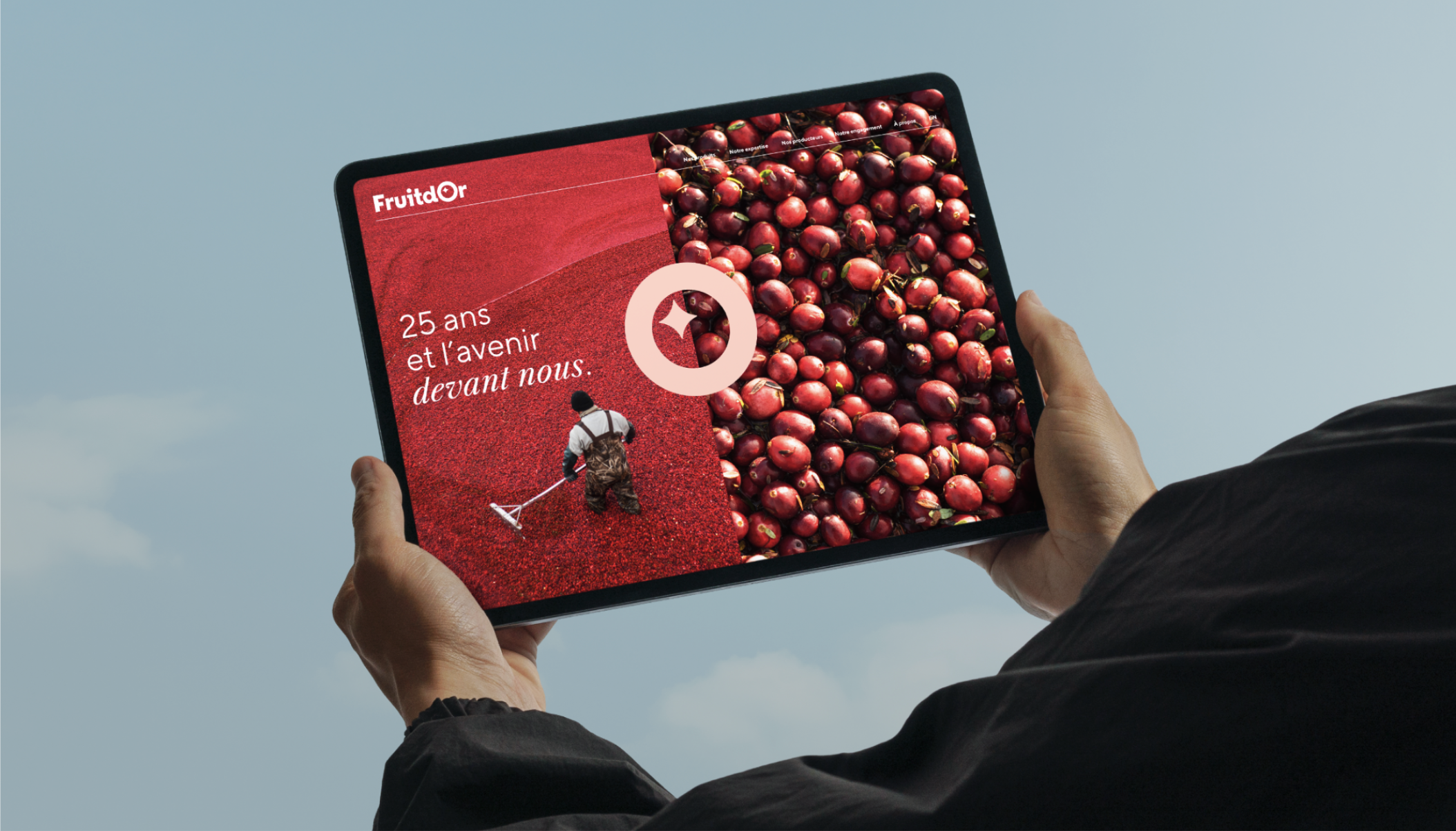
The photographic direction combines wide, visionary landscapes with intimate, human-centered close-ups, highlighting both scale and craftsmanship. The result is a distinctive visual universe aligned with the company’s true stature. The refreshed identity extends across all touchpoints—from logo and stationery to packaging, sales materials, corporate video, trade show booths, and promotional items—ensuring a consistent, confident, and elevated presence across global markets.
Active listening. Ongoing exchanges. Empathetic dialogues. That’s how we work with you. Let’s start now.
© 2025 La Famille